Album covers have sadly become a lost art in the twenty-first century. Stemming from the international standardization of MP3 in the early 90’s, to the iPod revolution in the early 2000’s, to the rise of today’s download and stream-friendly platforms like iTunes, YouTube and Spotify, album covers have regretfully been reduced to the size of a stamp and are only truly cherished by a small minority of people.
This will explain why some of the best and most iconic album covers date back to the 60’s and 70’s – a time all music lovers associate as the ‘glory’ years; a time when everything to do with music was treasured at its face value; a time when album covers captured “the dreams, hopes and fears of a music-loving generation” and when studying the sleeve was part of the whole-rounded experience of owning an LP.
Here are our picks for the 20 greatest album covers of all time. We review our favourite 10 in date-release order.
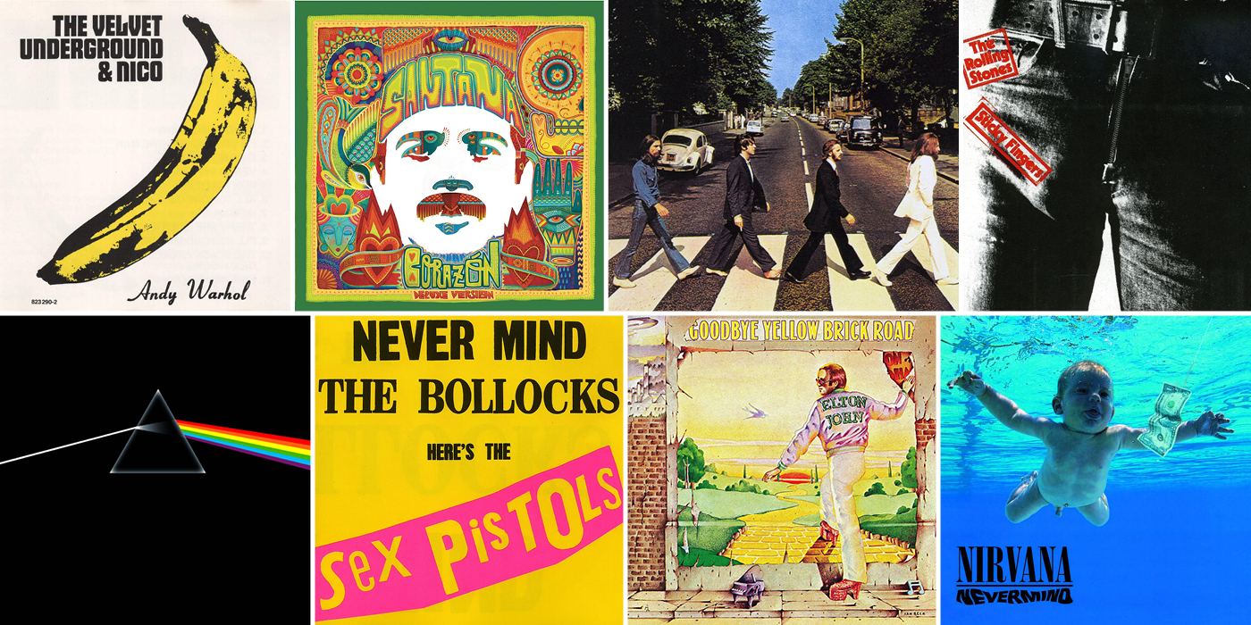
1. The Velvet Underground – “The Velvet Underground and Nico” (1967)
The bright yellow banana that graced the cover of The Velvet Underground and Nico’s debut album has become one of the most recognised pieces of pop artwork ever, crafted by the most popular pop artist ever, Andy Warhol, who also produced this 1967 protopunk album. The original album cover was interactive, telling fans to “peel slowly and see” and allowing them to peel back the banana skin sticker that revealed a pink banana underneath. Part of the reason behind the album’s delayed release was because manufacturers found it hard to pull-off the sexually charged effect of peeling the banana.
Although the album saw no commercial success, the band eventually became a cult favourite in the decades after The Velvet Underground broke up. Today, the album has become a rare collector’s item and an emblem of the protopunk genre.
2. Cream – “Disraeli Gears” (1967)

Created by Australian artist, Martin Sharp, the cover of Cream’s “Disreali Gears” album has become an icon of spiralling fluorescent movement of the 60’s. Sharp combined Victorian elements and loads of “flower-power” roses and feathers with a publicity photo he had been given by Eric Clapton. Sharp attempted to capture the sound of the psychedelic music in the cover, which he described as a “warm, fluorescent sound”, by first drawing the cover in black and white and then colouring it in with fluorescent, eye-stinging, colours.
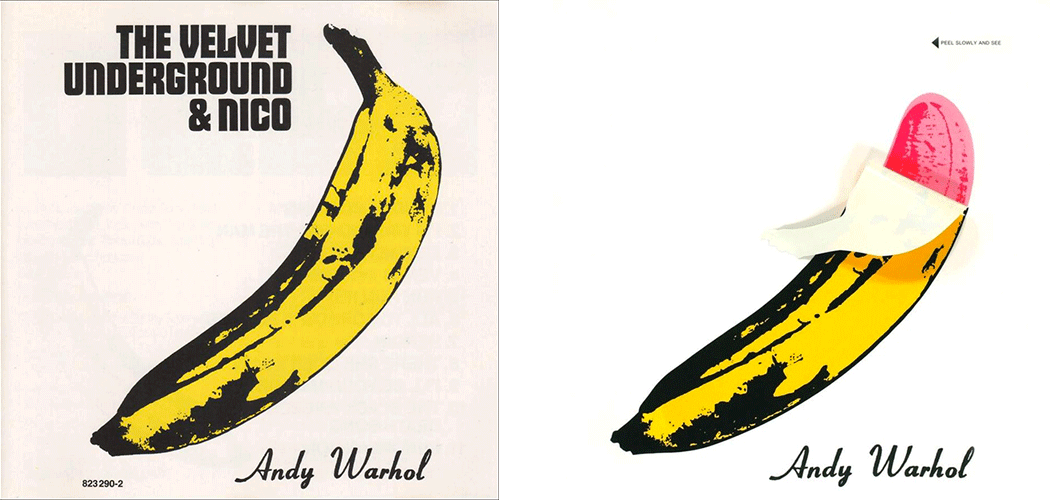
3. The Beatles – “Abbey Road” (1969)
Those who believed Paul McCartney’s death myth in 1967 analysed the cover of Abbey Road. They believed that McCartney has been replaced by a dopplegänger and interpreted the picture as a funeral procession, with John Lennon as the preacher (dressed in white), Ringo Star as the mourner (dressed in black), George Harrison as the gravedigger (dressed in denim) and Paul McCartney as the corpse (walking barefoot). They also believed that the license plate in the background read 281f, symbolising McCartney’s death at the age of 27 (when the album came out) and making people think the message was intended to represent McCartney turning 28, had he not died. All of the latter was pure coincidence. The Beatles shot the cover of the album on August 8th, 1969 outside of Abbey Road studios.
The cover is the most recognised album cover in pop music history and has been parodied several times. Today, Abbey Road is one of the most popular tourist attractions in the London area.
4. The Rolling Stones – “Sticky Fingers” (1971)

“Sticky Fingers” was The Rolling Stones’ first album for Atlantic Records, which provided them with the budget to mass-produce their cover art with an actual zipper. Designed by Andy Warhol, the zipper on the album’s cover could be unzipped to reveal white underwear with the Rolling Stones’ tongue logo plastered on it. Nobody seems to know who exactly was the man in the underwear, but it wasn’t Mick Jagger’s crotch, contrary to the popular myth.
5. Pink Floyd – “Dark Side Of The Moon” (1973)
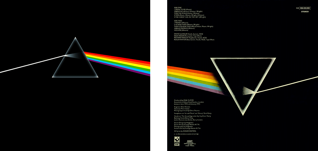
The design of the iconic album cover for “Dark Side Of The Moon” represents three elements; the band’s stage lighting, that comes through via the prism of light, Richard Wright’s request for a “simple and bold” graphic design, and a triangle to symbolise thought and ambition, a subject that comes through in the album lyrics. The initial inspiration for the album cover art was a black and white photo of a prism on top of some sheet music, with a colour beam going through it. Storm Thorgerson, George Hardie, and the team at Hipgnosis, took these initial ideas as a starting point and eventually came up with the iconic prism-and-rainbow design set against a black background.
6. Led Zeppelin – “House Of The Holy” (1973)
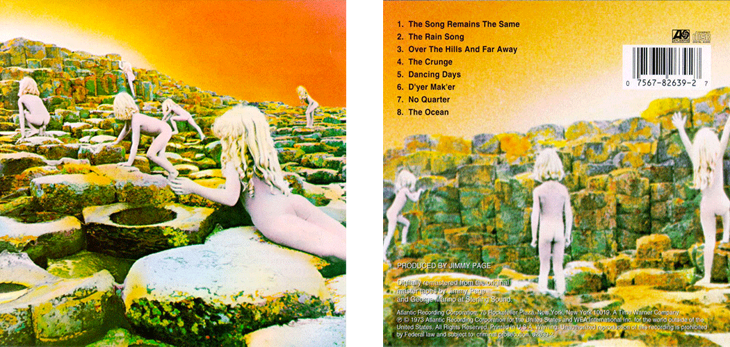
Inspired by the ending of Arthur C. Clark’s novel, “Childhood’s End”, which portrayed several hundreds of naked children wandering the earth, Led Zeppelin’s artwork for their “House Of The Holy” album has become one of the most iconic and most mysterious album covers of the 70’s. Produced by the design firm Hipgnosis, the cover was shot on the Giant’s Causeway in Northern Ireland. Audrey Powell, who designed the cover, photographed two children, a brother and sister, over the course of ten days at dusk and at dawn. The children were to originally be tinted in gold and silver but the hand tinting accidentally went wrong. Powell explains: “when we hand-tinted it, the airbrush artist, by accident, put a kind of purple tinge onto them. When I first saw it, I said, “Oh, my God.” Then we looked at it, and I said, “Hang on a minute, this has an otherworldly quality.” So we left it as it was”. The siblings were later multi-printed to create a small army of 11 children.
7. The Sex Pistols – “Never Mind The Bollocks Here’s The Sex Pistols” (1977)
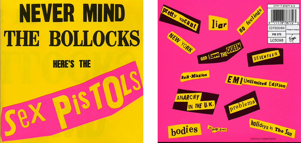
According to Steve Jones, the album’s title, which was originally going to be titled God Save Sex Pistols, was taken from two fans who would always say the phrase “never mind the bollocks” to one another. Due to the album’s indecent use of language, the police filed an obscenity case and tried to prosecute Virgin Rercords for displaying it on their shop shelves. The Sex Pistols and Virgin Records were found not guilty after their lawyer, Queen’s Council John Mortimer, produced expert witnesses who could demonstrate that the word “bollocks” was a legitimate Old English term originally used to refer to a priest, and which also meant “nonsense”, in the context of the title.
Art director of the Sex Pistols and designer of the album cover, Jamie Reid, explains: “I saw Punk as part of an art movement that’s gone over the last hundred years, with roots of Russian agitpop, surrealism, dada and situationism”.
The cover became a blueprint for punk design.
8. The Clash – “London Calling” (1979)
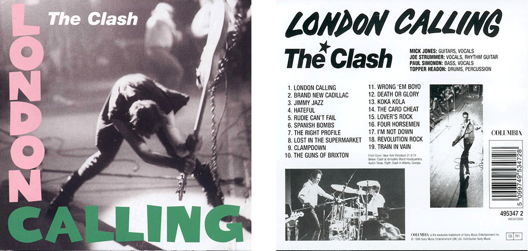
Pennie Smith captured one of the most iconic pictures in rock music history, while taking pictures of the Clash at New York’s Palladium in September of 1979.
Simonon explains: “we weren’t getting any response from them [the audience], no matter what we did. I’m generally good-natured, but I do bottle things up and then I’m like a light switch, off and on, and it can be quite scary, even for me, when I switch, because it’s very sudden. Onstage that night I just got so frustrated with that crowd and when I go to the breaking point I started to chop the stage up with my guitar”.
…Talk about rock n’ roll!
9. Nirvana – “Nevermind” (1991)
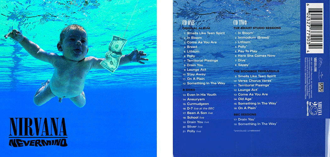
The naked baby floating underwater on Nirvana’s “Nevermind” album is one of the most eye-catching album covers of all time. According to photographer Kirk Weddle, the image was “a fluke”. Kirk completed the shoot at a public pool in Pasadena in Southern California, after convincing his friends to use their four-month-old baby boy for the cover, of which the original concept was to capture an underwater birth. Kirk explained: “the mom was on my left, and blew a puff of air into the child’s face… then we dunked him in and, bang bang, pulled him out. We did it twice and that was it”. The fish hook and dollar bill were added by the record label’s art department as finishing touches. Indeed, “the baby has a platinum album”, says Kirk. Today, Spencer Eden, the infamous naked baby, admits: “It’s kind of creepy that many people have seen me naked… I feel like the world’s biggest porn star.”
10. Santana – “Corazon” (2014)
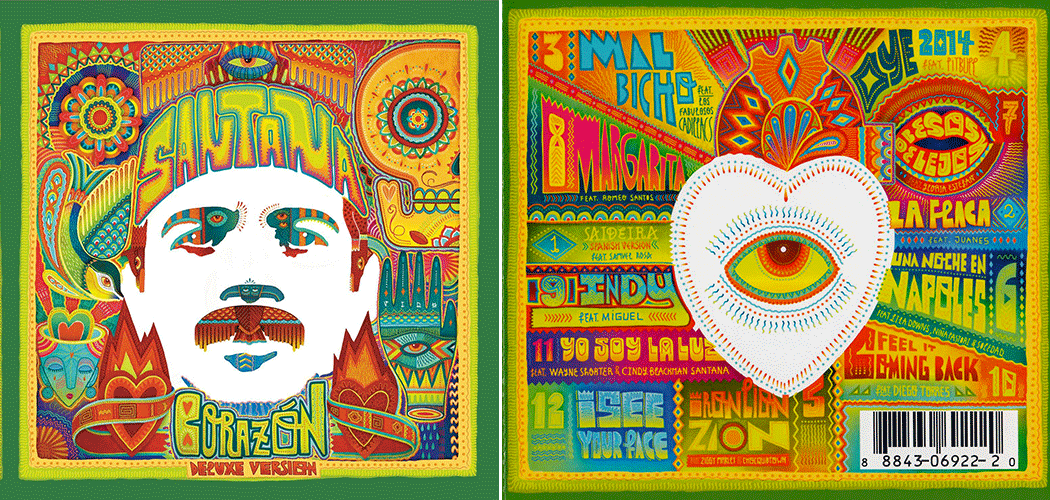
Santana’s unique cover art for the latest and very first all-Latin music album “Corazon” was designed by art collective Boa Mistura, who is based in Madrid and works on public art pieces and developing projects in South Africa, Norway, Berlin, Sao Paulo, and Rio de Janeiro. Full of bright colours, this album cover is a beautiful eye-catcher.
11. Frank Sinatra – “In The Wee Small Hours” (1955) / 12. The Beatles – “Revolver” (1966)
13. King Crimson – “In The Court Of The Crimson King” (1969) / 14. The Who – “Who’s Next” (1971)
15. Stevie Wonder – “Innervisions” (1973) / 16. Elton John – “ Goodbye Yellow Brick Road” (1973)
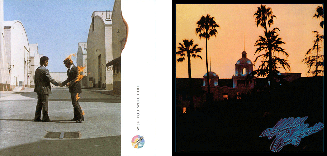
17. Pink Floyd – “Wish You Were Here” (1975) / 18. The Eagles – “Hotel California” (1976)
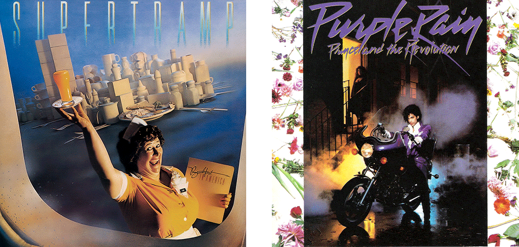
19. Supertramp – “Breakfast In America” (1979) / 20. Prince – “Purple Rain” (1984)
Don’t have Creation 5? Download it from the App Store!
| iPhone | iPad |